


Category: Print · Roles: Art Director & Designer · Client: Eglo Records
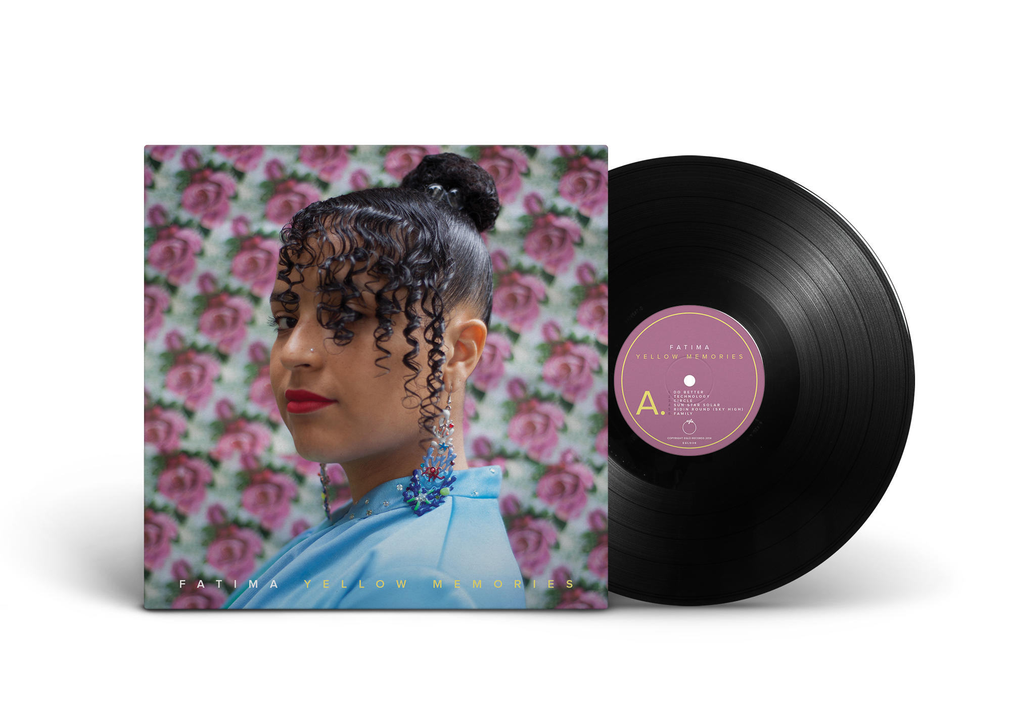
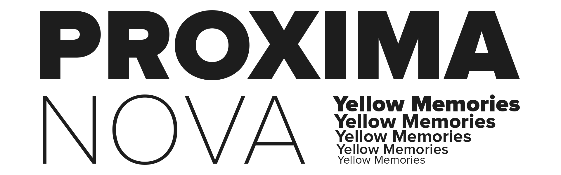
This album cover is for Fatima's debut album, in other words a very important record for her personally. Taking that in consideration I felt it needed to express pride and strength. The copy needed to have stable roots, feeling robust and powerful. It felt obvious to use a san serif, and I fell for the mighty Proxima Nova typeface. It communicates all the above with elegance.
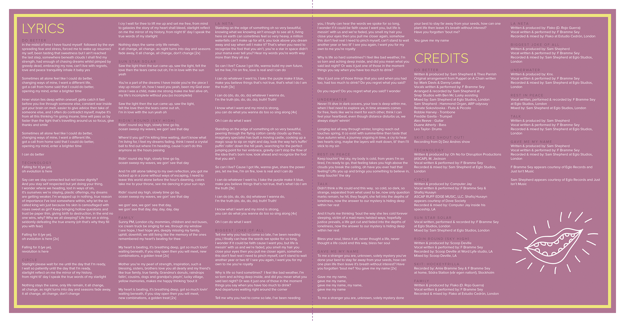
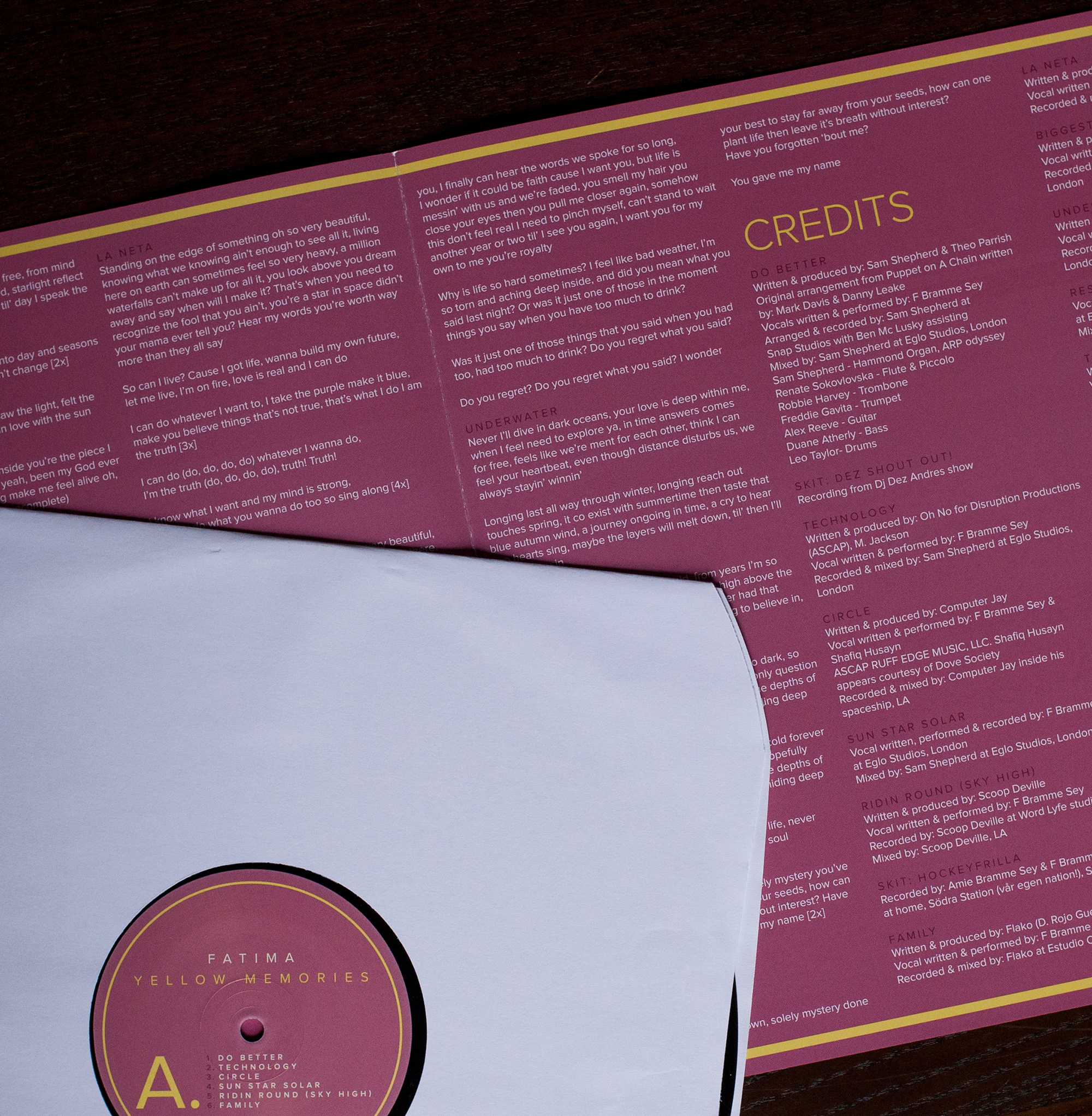
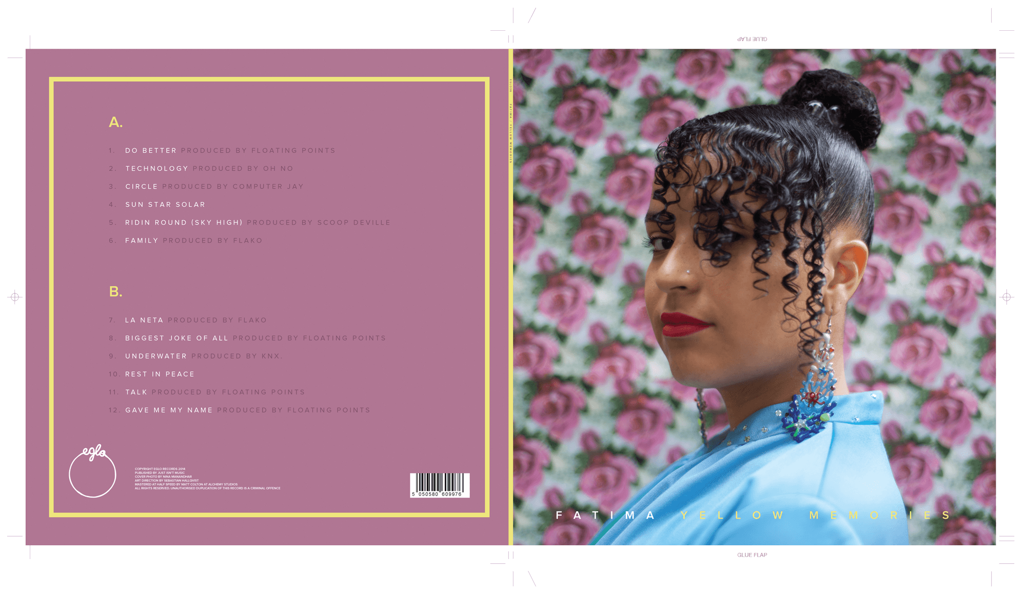
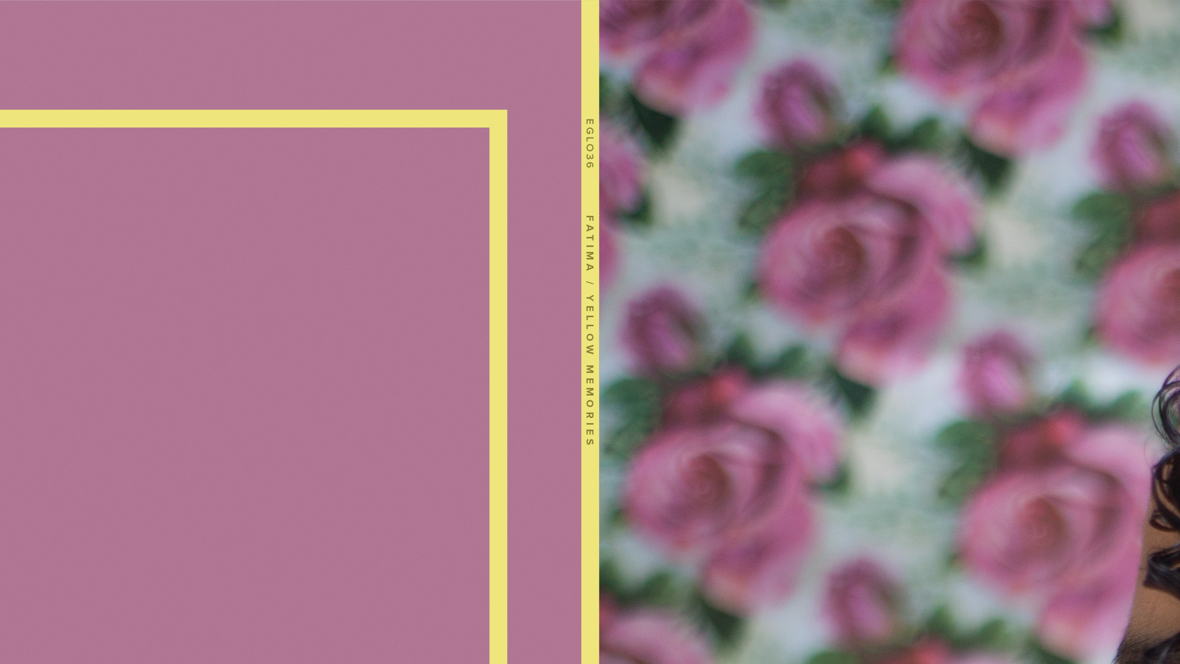
As for the Iook and feel I found a lot of inspiration from the 60's, like washed out colors and the use of borders to incapsulate information.

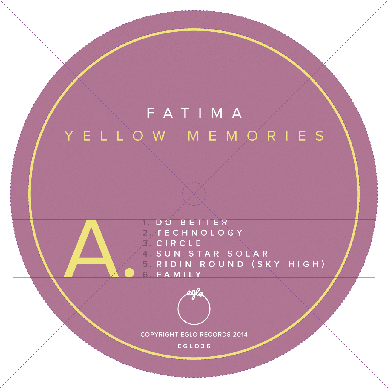
For the front cover Nina Manandhar had taken a great photo of Fatima, I didn't want to take away the focus from the picture too much. Therefore I placed the album title at the bottom in a subtle yellow color that is used through out the artwork. Below (and above) you can see examples of the yellow borders I use to frame the information.
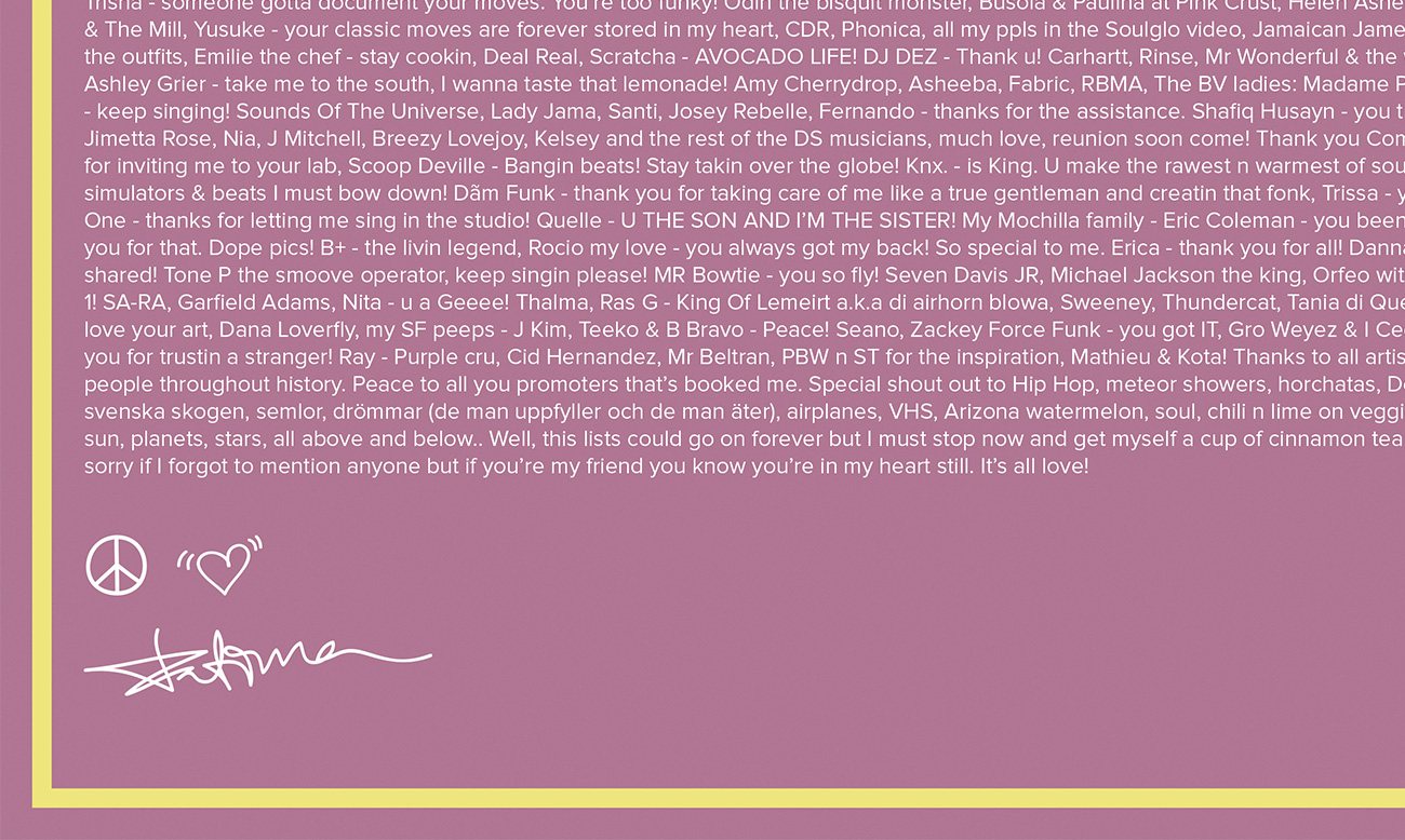
The inner sleeve is packed with all the lyrics from every song on the album and personal photographs. To give it a more personal feeling I had the idea to give Fatima my tablet and pen to scribble her messages of love with her own handwriting style.